The design norm in most past political cycles seemed to be relatively formulaic. There have traditionally been a lot of similarities between candidates’ design choices in terms of logos, colors, and layouts — which sucks.
2016 has been the first cycle in recent memory (mostly sparked by President Obama’s campaign in 2008) to really showcase the role and value design has garnered in politics.
Taking an objective look at the designs of this year’s candidates, here is what I feel are the strongest websites for the 2016 political cycle.
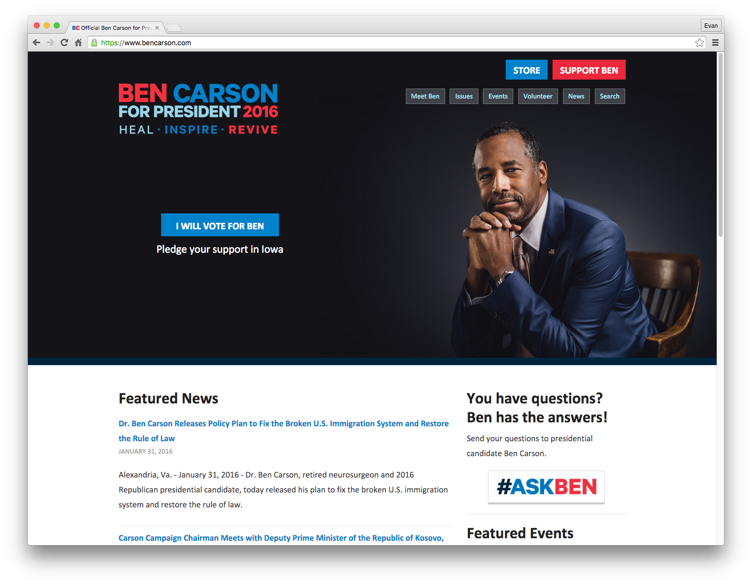
#10) Ben Carson, Republican — BenCarson.com
Carson’s website narrowly makes the top 10 — mostly for having a slightly stronger hero image than John Kasich’s website. All of the standards options are present (navigation, donate, etc.) even if they are relatively plain. The logo lacks character and isn’t helping sculpt an individual identity for this campaign.
There’s no denying that it is simple (read: boring). Most importantly, its simple layout provides a large amount of space and emphasis for its main call-to-action.
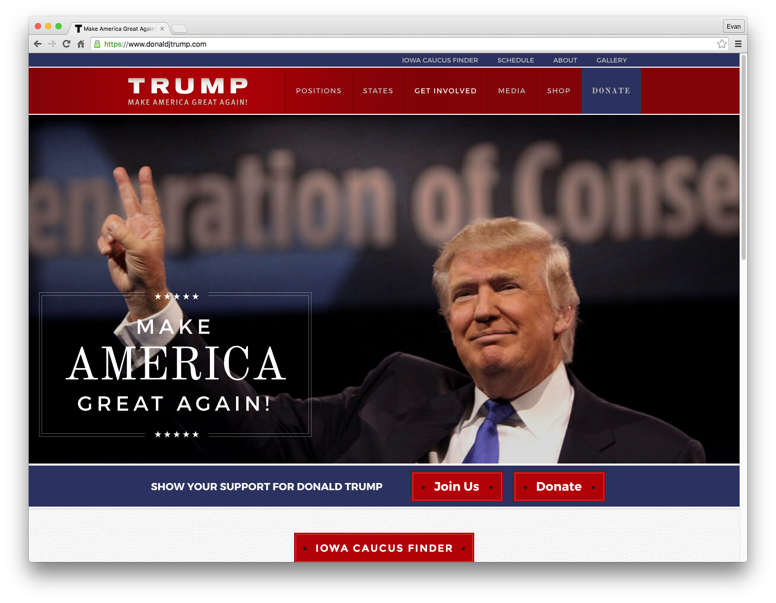
#9) Donald Trump, Republican — DonaldJTrump.com
Trump falls securely at #9 for two main reasons— which just happen to be same: 1) it’s old-looking style, 2) it’s old-looking style that clearly works for his audience. It’s likely that the average Trump supporter will visit the site and appreciate the very traditional political style (colors, typefaces, etc.).
The bland slogan and logo don’t help the creativity department but the large and simple targets for the main navigation and donation button are surely doing their jobs.
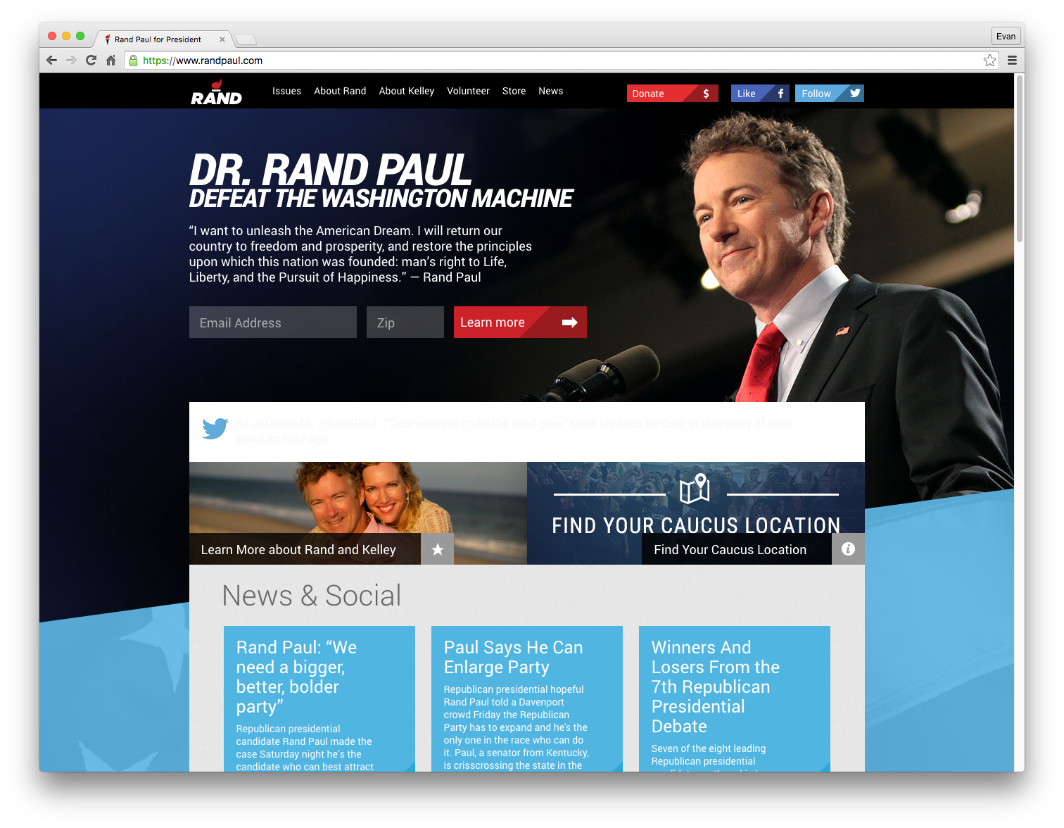
#8) Rand Paul, Republican — RandPaul.com
Paul’s website, which may look busy at first glance, actually does a good job at fitting in important elements above-the-fold. Strongest elements to the layout include an active hero image and a unique logo. The combination of italicized text and slanted design elements give Paul’s website a unique feeling.
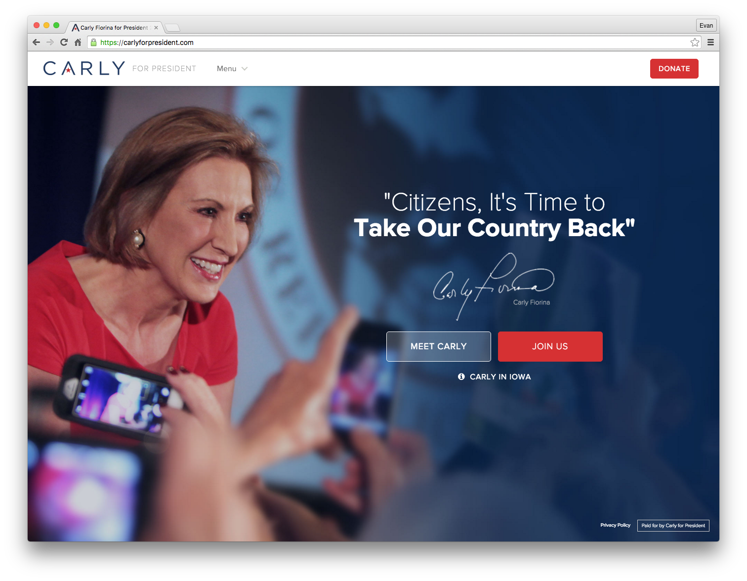
#7) Carly Fiorina, Republican — CarlyForPresident.com
Fiorina’s design sense has been strong throughout the campaign. The typefaces and colors have given a modern and contemporary feeling to her brand, especially her logo.
Unfortunately, the consistent problem that keeps her from ranking higher is the website’s over-simplified layout. At first glance, the website almost looks as though it is unfinished or is just a splash page. I’m left wanting more substance and options on the homepage.
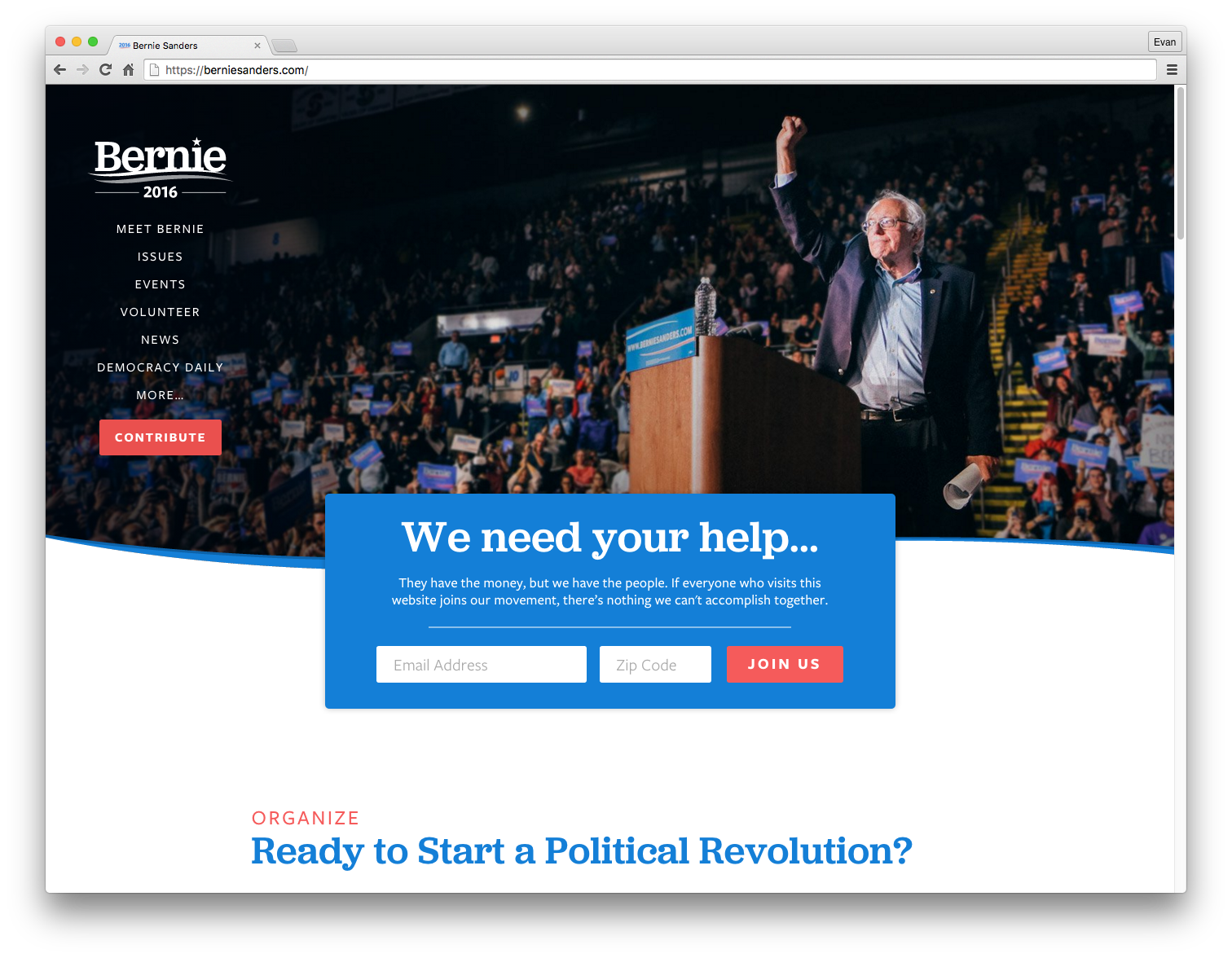
#6) Bernie Sanders, Democrat — BernieSanders.com
Sanders is utilizing some strong typefaces and color choices with his simple layout. The amount of space used above-the-fold gives it a relaxing feeling, but also works against the usability in that any major pieces of content are pushed far down the page.
Like most of the candidate’s websites, Sanders frequently swaps out his hero image (unfortunately being a less-strong one at the time of this review). A strong and emotional headline with the rather generic logo leave me feeling indifferent (safe?) overall.
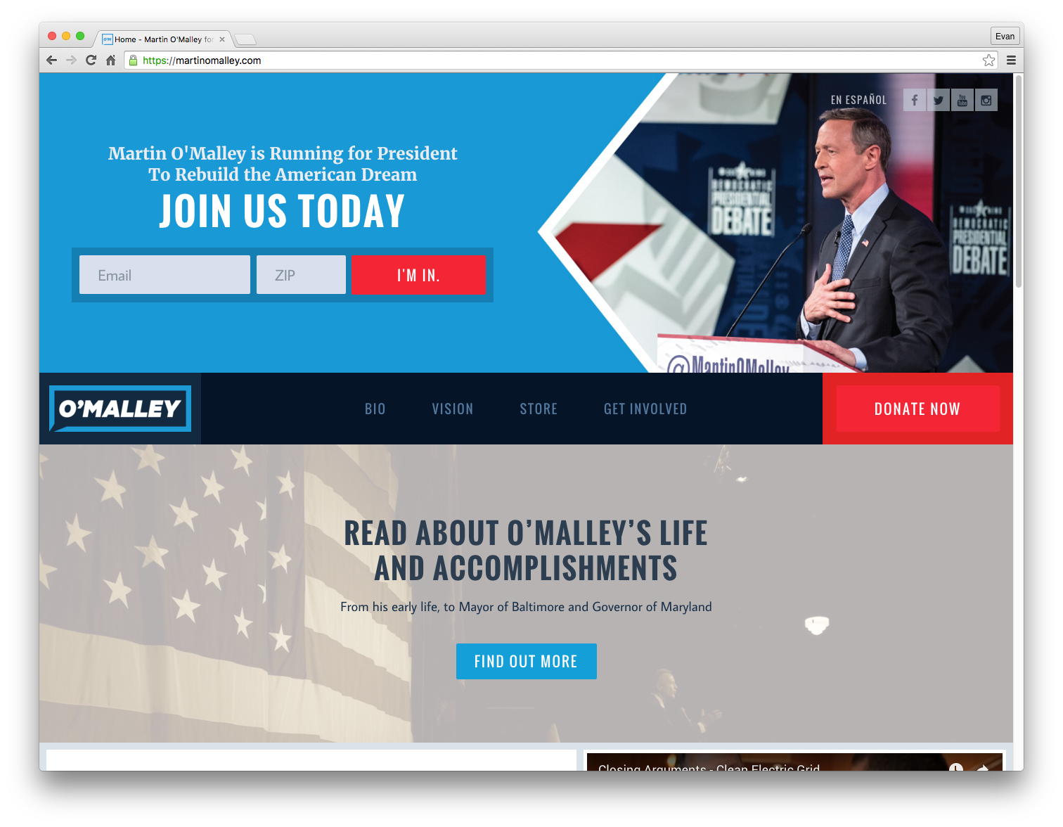
#5) Martin O’Malley, Democrat — MartinOMalley.com
O’Malley hasn’t received a great amount of attention during the campaign, but it’s not due to a dull web presence. Amongst its many successes, its one major downfall would be the designation of valuable space to his life story. I’m left feeling that this section could possible tackle a more relevant topic (usually a candidates biography section is secondary information).
I actually found his use of typefaces and colors to be energetic. The main navigation is bold and cannot be missed, as well as the option for donating. The logo is a unique take on a politician’s logo and definitely stands out amongst this crowd. A strong example of modern, flat design.
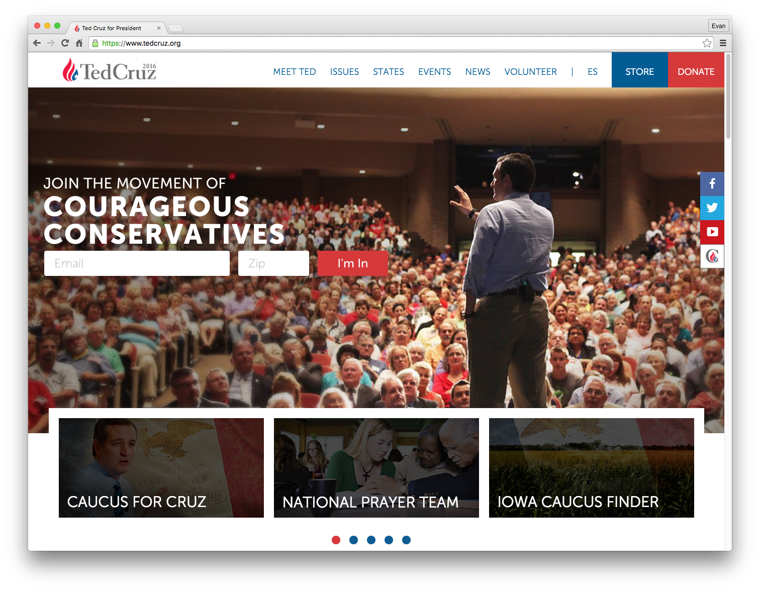
#4) Ted Cruz, Republican — TedCruz.org
In the era of web design where emotional photography is more important than ever, the website for Cruz comes through strong and provides an active feeling on first impression. The main navigation is unmissable and the well-placed hero image flanks the main call-to-action.
The branding utilizes a normally boring grey color alongside the traditional reds and blues in a way that just works. The logo mark is stronger than the more-generic text treatment. Looking at the elements of this design individually isn’t overly-compelling — but somehow works as a whole.
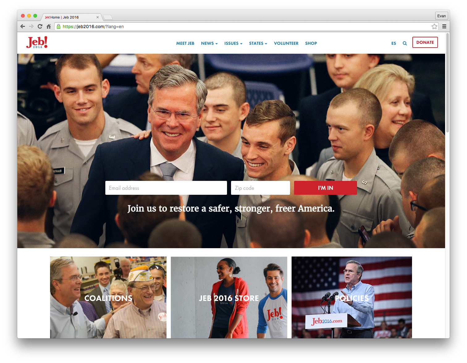
#3) Jeb Bush, Republican — Jeb2016.com
Bush’s website is actually incredibly similar to the website for Cruz. So much that a lot of my comments above would double for Jeb. The major differences that put Bush over Cruz in this design battle would be a better use of full-color bucket images below the main hero. Stronger typeface selections and main navigation positioning also help — as well as what I consider to be one of the strongest and most unique logos of the 2016 cycle.
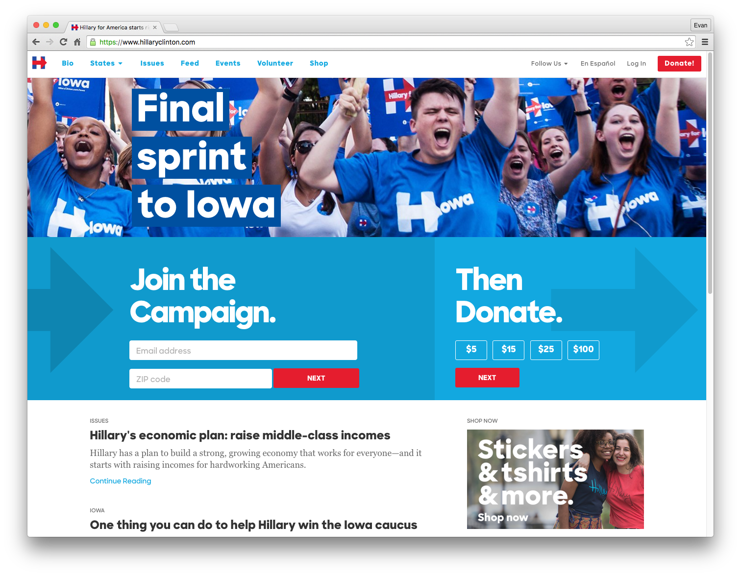
#2) Hillary Clinton, Democrat — HillaryClinton.com
Clinton’s website is possibly the strongest example of modern web design in this campaign cycle. Simple and bold typefaces as well as flat design make this the design I would expect to see on any new non-political website.
It’s clear that this design sense effectively targets and connects with a younger audience, while not ignoring older audiences. The main navigation is clear and provides exactly what you would be looking for. The main hero area is actively updated with the issues that are currently relevant (the Iowa caucuses in this example). It’s also widely-regarded as one of the stronger, if not the strongest, logo on the campaign trail.
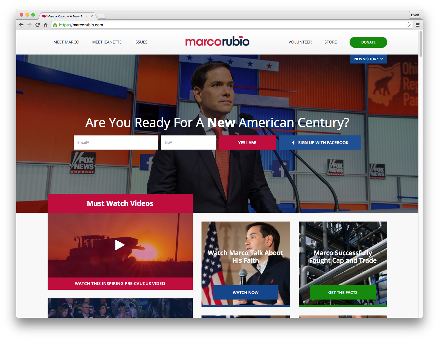
#1) Marco Rubio, Republican — MarcoRubio.com
I’ve spent months periodically checking a lot of these candidates websites. The Rubio campaign’s website remains a consistently pleasing experience. Like a few of the examples above (Bush, Cruz), Rubio’s website emphasizes the main call-to-action in the form of a newsletter signup behind a well-chosen hero image. The variety of colors in both photography and type don’t feel busy as one might expect.
The main buckets below the hero transition well into an active feed of topics which span the length of the homepage in a relaxed masonry style. The beautiful typeface and colors for the logo are a fresh take on political branding, using a rich pink/red color as well as a deep blue. The elements combine to give this layout the most well-balanced feeling of all the candidate’s website.
Honorable Mentions
- 11) John Kasich: A slightly less visually-pleasing website, nudged out by Carson
- 12) Chris Christie: A boring layout with even more boring branding
- 13) Rick Santorum: A nice logo with nothing special going on website-wise
- 14) Mike Huckabee: The most confusing web experience I could ever imagine, personified
Featured image credit: CNN